Real sellers. Real numbers. No stock photos, no made-up metrics.

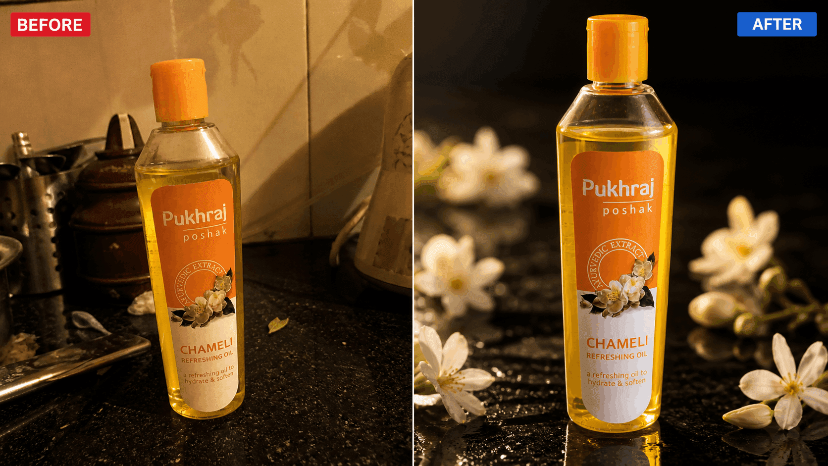
Pukhraj had a quality jasmine oil product but their Flipkart listing was driving buyers away. Phone camera images, off-white background, product filling 40% of frame. Buyers landed on the listing and kept scrolling. They weren't losing on product. They were losing on presentation.
We rebuilt the entire visual identity for Flipkart - studio-quality hero image, white background compliant, product fills 85% of frame, shadow work, ingredient callout infographics, and lifestyle imagery. Every image designed to stop the scroll and answer a buyer objection before they could ask it.
Phone camera shot, off-white background, product too small in frame
Studio-quality white background render, shadow work, Flipkart compliant
"We always knew our product was good. PV Labs made our listing show that. Clicks doubled in the first week itself."

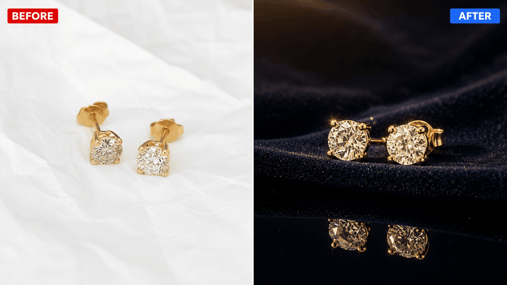
Nipura Jewellery was live on Myntra but had a default seller page - no RPD modules, no brand banner, no material callouts, no size reference. In a category full of premium-looking jewellery brands, they were completely invisible. Buyers couldn't see the craftsmanship. Price looked unjustified.
We designed a complete Myntra RPD brand story banner, material callout modules showing 92.5 sterling silver hallmark, styling guide with Indian skin tone reference, size and weight reference for every earring. Now the listing sells the craftsmanship before the buyer even reads a word.
Default Myntra page, no RPD, no brand identity, no modules
Complete RPD material callouts, styling guide, size reference live
"The difference was night and day. Our listing finally looked like the brand we actually are. Orders picked up the same week RPD went live."
Sound familiar?
Show us your listing
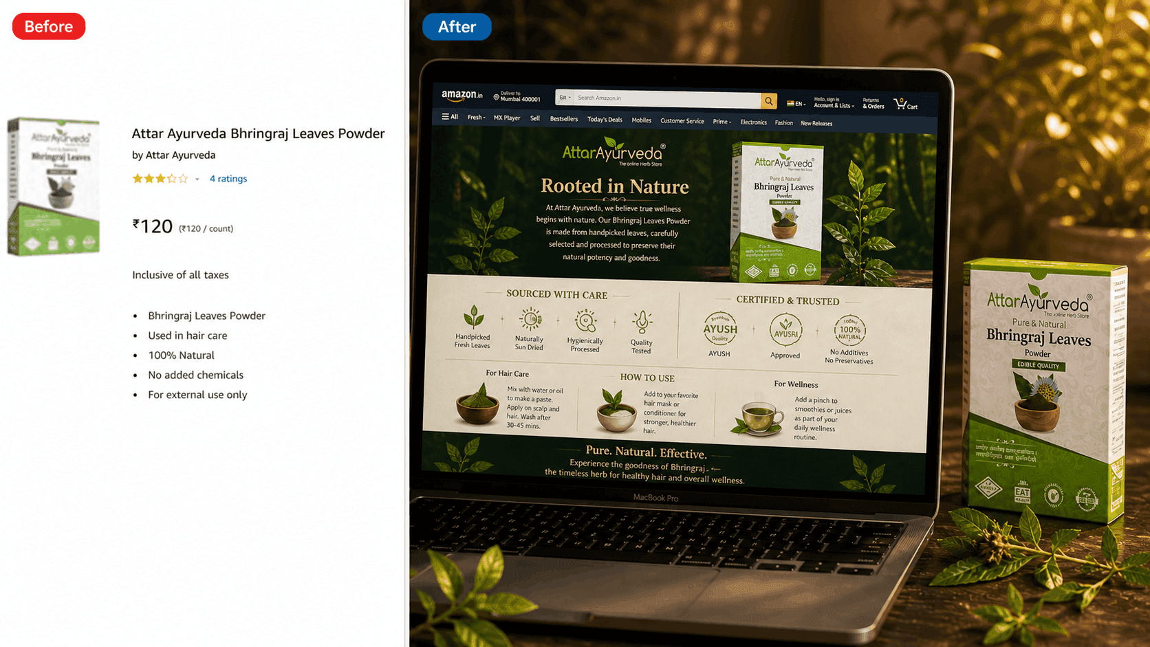
Attar Ayurveda had a quality bhringraj powder product but their Amazon listing was plain text only no banners, no visuals, no brand story, no ingredient callouts. Competitors with A+ content were outranking them despite an inferior product. Buyers had no reason to trust an Ayurvedic health product with zero visual credibility.
We built a complete A+ module from scratch - Ayurvedic brand story banner, ingredient sourcing story, usage guide visuals, Ayush certification highlight, and lifestyle imagery showing the product in daily routine. All within Amazon's EBC guidelines. Every module built to establish trust before the buyer scrolls to reviews.
Plain text description, no banners, no visuals, no brand story
Full A+ module - ingredient sourcing, usage guide, certification highlights
"Our product was always Ayurvedic and pure. PV Labs made our listing prove it. The A+ content they built is the reason buyers trust us before even reading reviews."

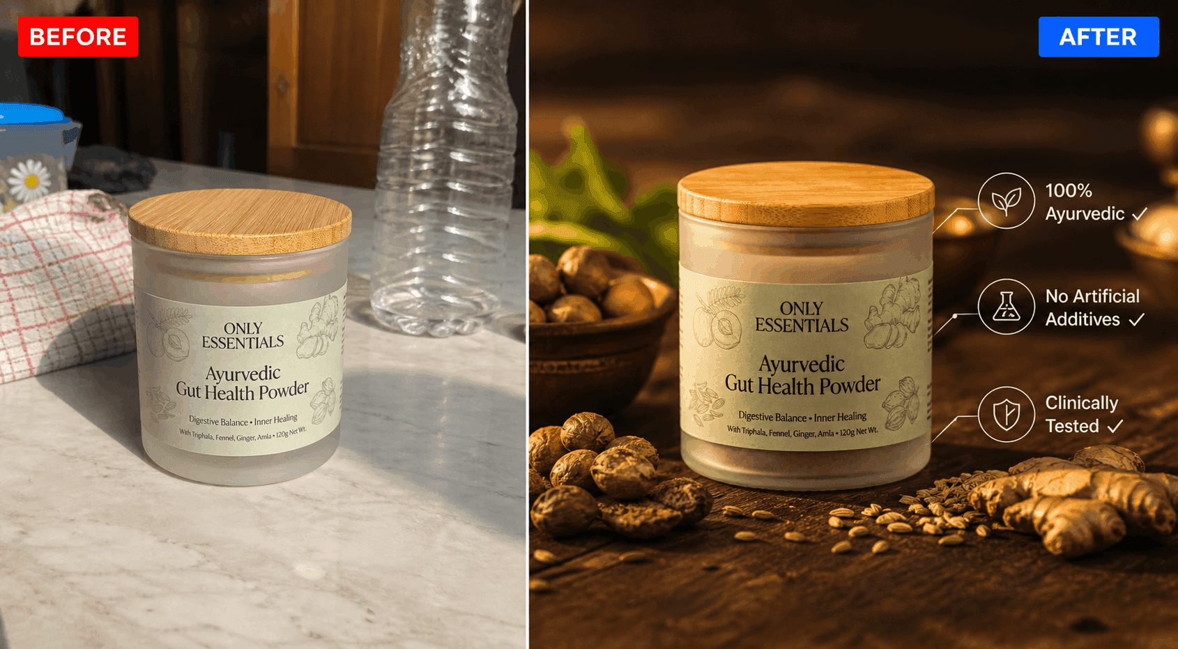
Only Essentials had a quality Ayurvedic gut health powder but their D2C website had generic product images no ingredient storytelling, no lifestyle context, no trust badges, no brand visual system. In a category where trust is everything, their visuals were costing them credibility before buyers even read the description.
We created a complete D2C visual set premium product hero images, ingredient callout infographics with Ayush certification prominently highlighted, lifestyle imagery showing morning routine context, and trust badge graphics. Every visual designed to build credibility and convert a first-time buyer who has never heard of the brand.
Generic images, no ingredient story, no trust badges, no brand identity
Premium D2C visual set ingredient callouts, lifestyle imagery, trust badges, Ayurvedic positioning clear
"We always struggled to show buyers why our product was worth trusting. PV Labs built visuals that do that automatically without us saying a word."

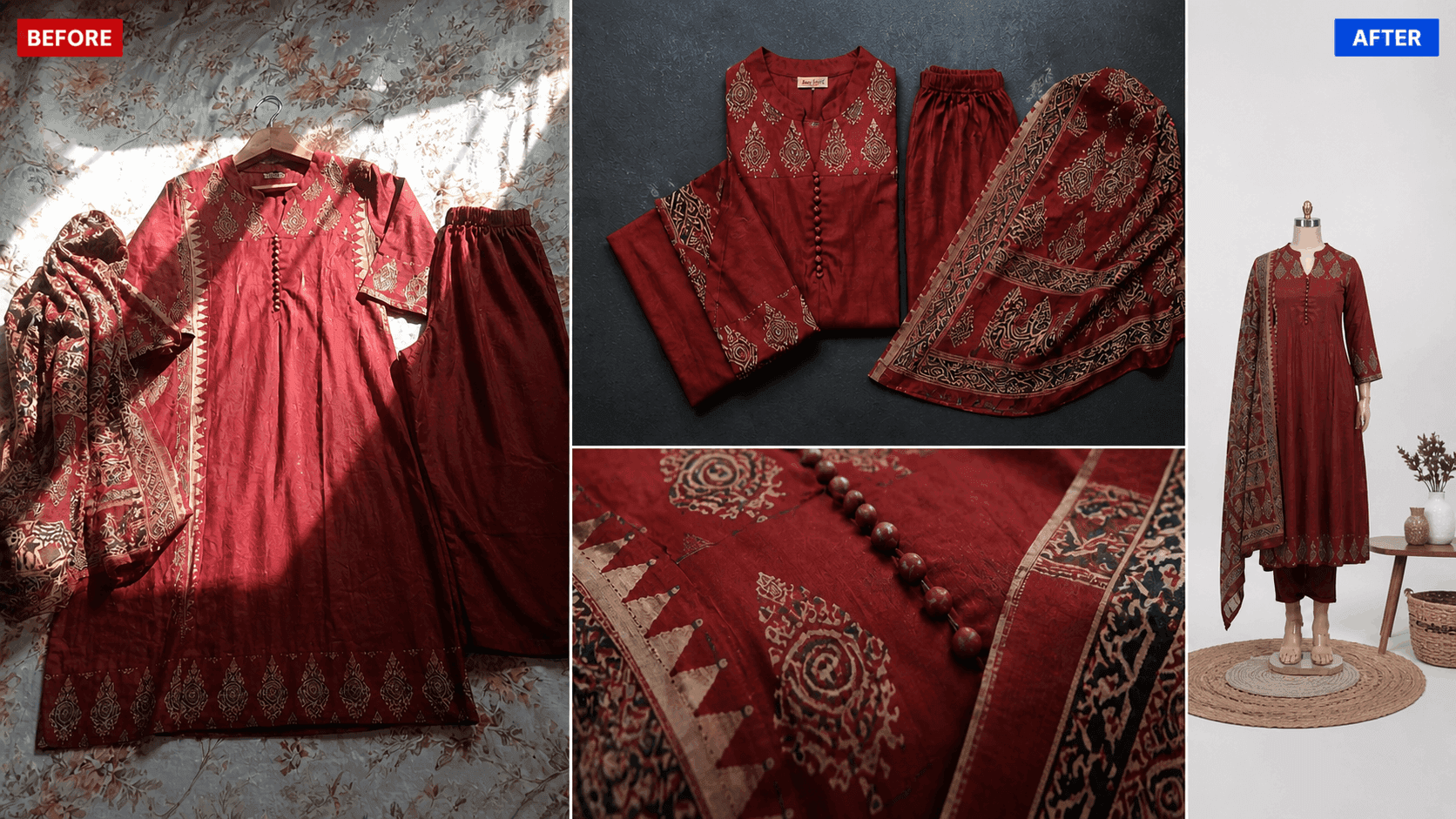
Aakirti had 40+ ethnic suit SKUs ready to list on Ajio but only had basic front-facing images no flat lays, no detail shots, no fabric close-ups, no lifestyle context. Ajio's catalog standards require multiple angles and lifestyle imagery their listings kept getting rejected. Beautiful suits, invisible on the platform.
We created a complete catalog set for all 40+ SKUs flat lay, styled shot, detail shot, and fabric texture close-up per SKU. Standardized visual language across the entire range so the brand looked cohesive on Ajio's grid. Every image built to Ajio's exact catalog specifications.
Basic front-facing images, listing rejections, no catalog standard
Complete catalog set flat lay, detail shot, size guide, Ajio compliant
"Three rejections before PV Labs. They got every single SKU approved on the first try. That's the difference between designers and e-commerce specialists."

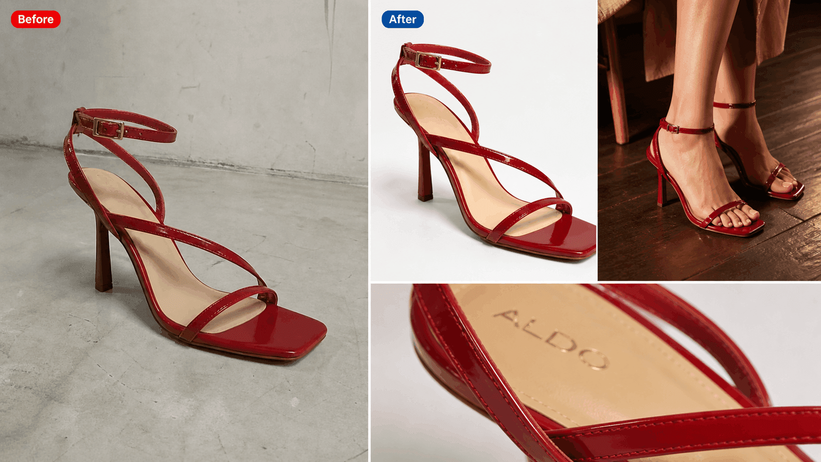
ALDO had a quality sandal product selling on marketplaces but zero D2C presence no website, no brand identity online, no direct customer relationship. Their product visuals were inconsistent different angles, different lighting, different backgrounds across platforms. No visual system. No brand story. Buyers couldn't tell if this was a premium brand or a generic reseller.
We created a complete D2C visual set for ALDO's brand website premium product photography style visuals, multiple angles per SKU, lifestyle context shots showing sandals in real environments, clean white background hero images, and detail shots highlighting craftsmanship. Every visual consistent across the entire product range one unified brand language.
Inconsistent marketplace images, no brand identity, no visual system
Premium D2C visual set multiple angles, lifestyle context, consistent brand language
"We finally looked like a brand people would actually trust. PV Labs gave our sandals the visual identity they deserved. Our D2C website finally feels premium."

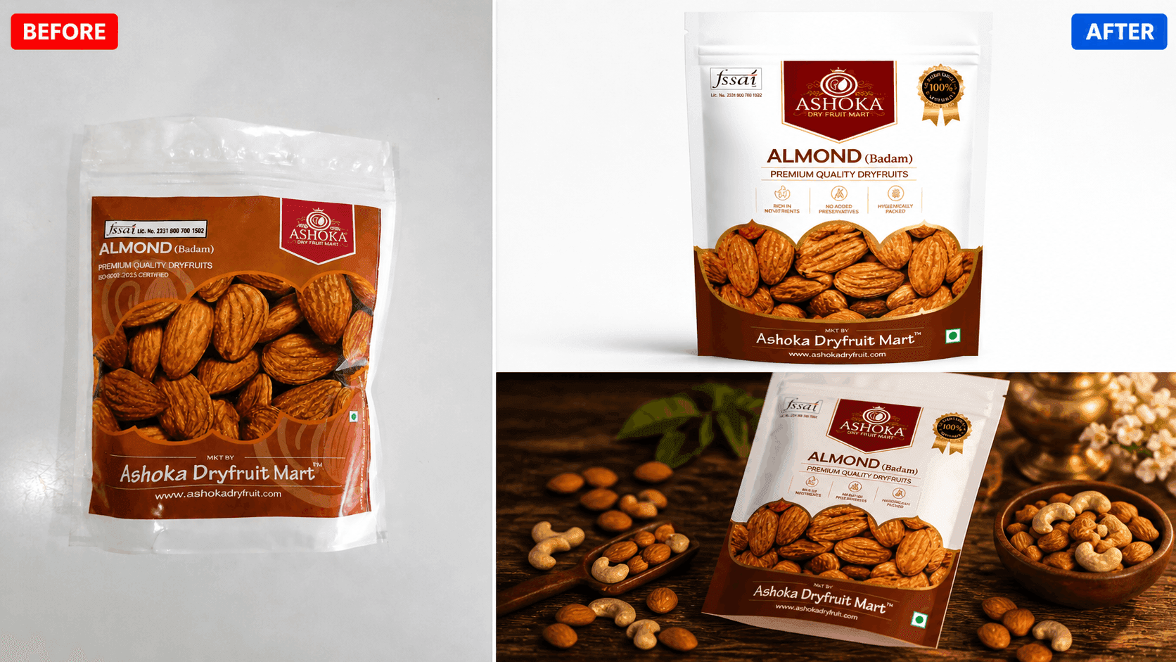
Ashoka had a quality dry fruits product but their packaging looked homemade basic label design, no brand color system, no visual hierarchy, no premium positioning. On Flipkart shelves dominated by established dry fruit brands, they were completely invisible. Same product on their website had completely different images zero consistency across platforms. Buyers couldn't justify the price because the packaging didn't match the quality.
We redesigned the complete packaging system for Ashoka new label design with premium color system, clear visual hierarchy, product window highlighting the dry fruits inside, FSSAI and quality certification badges prominently placed. Then extended the same visual language to Flipkart listing images and D2C website product visuals so every touchpoint told the same premium, consistent brand story.
Basic label, no brand system, inconsistent images across platforms
Premium packaging design unified visual language on Flipkart + website both
"Our product quality was always there. PV Labs made our packaging finally show it. We look like a premium brand now not just another dry fruits seller."

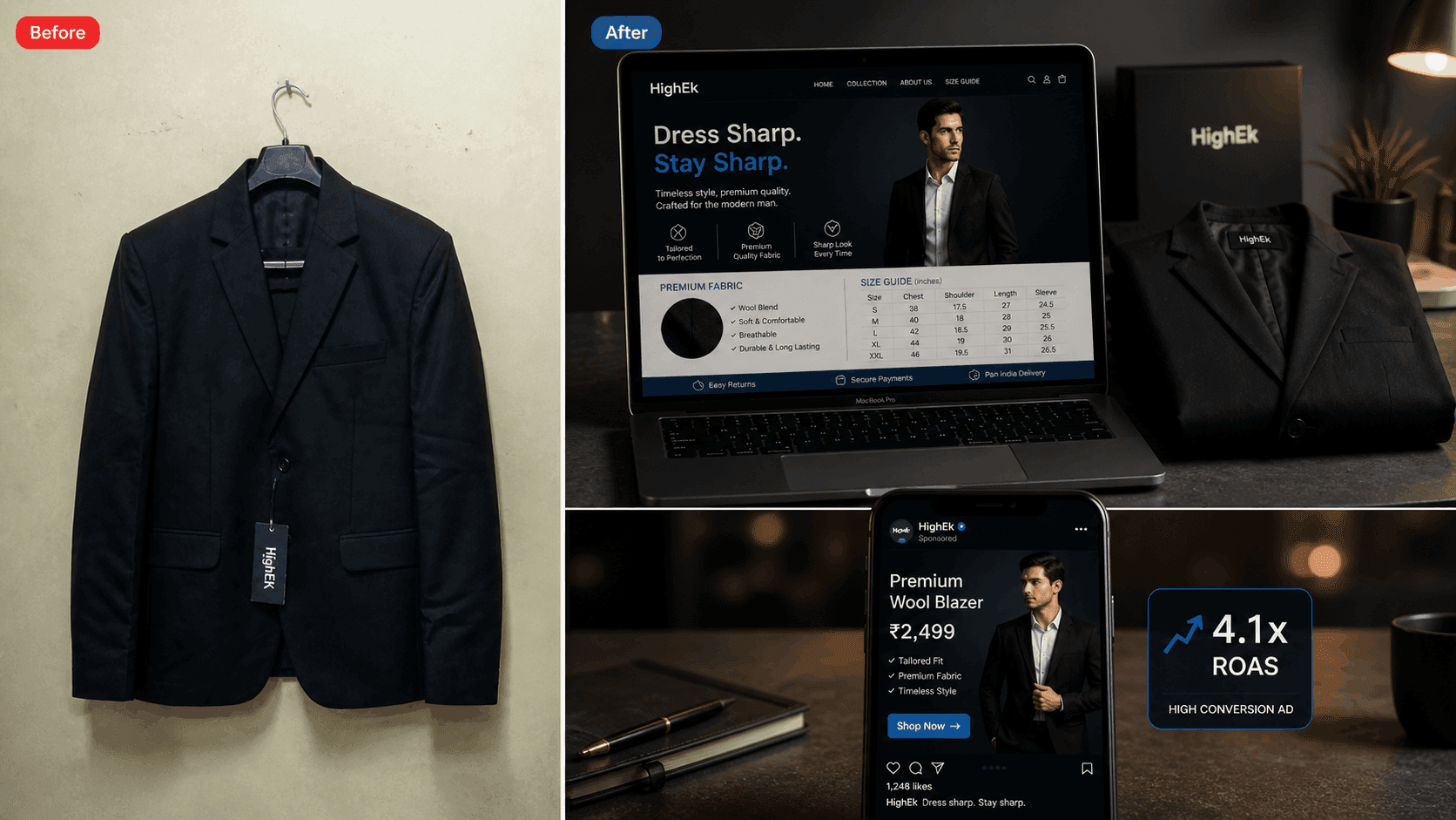
HighEk had a premium blazer product on Amazon but two critical problems first, zero brand identity: no consistent visual language, no brand story, no A+ content, nothing to differentiate from 100 other blazer sellers. Second, their Meta ad creatives were generic product shots with no conversion focus high spend, low returns. Money going out, sales not coming in. Both problems had the same root cause: no visual strategy.
We tackled both simultaneously. First, built a complete A+ content module for Amazon brand story banner, fabric detail highlights, size guide, styling imagery, care instructions. Then designed high-converting Meta ad creatives multiple formats, conversion-focused layouts, brand consistent design. Same visual language across Amazon listing and Meta ads so every touchpoint reinforced the same premium brand message.
Generic listing, no brand identity, low-converting ad creatives
Complete A+ content + high-converting Meta ad creatives same brand language across all touchpoints
"Two problems fixed in one project. Our Amazon listing finally looks premium and our ads are actually converting. PV Labs understood exactly what we needed."